Ninja B2C eCommerce Overhaul
Redesigning for Enhanced User Experience and Conversion

Overview
NinjaKitchen.com serves as the digital hub for Ninja’s innovative kitchen solutions, including blenders, air fryers, coffee makers, and other small appliances. With a diverse array of products and functionalities, the website needed to balance product discoverability, user engagement, and a seamless path to purchase. NinjaKitchen.com was preparing for a rapid redesign, and my team was tasked with auditing the build to ensure usability, consistency, and an optimized user experience.
Challenges
Time Sensitivity: The website needed to launch quickly, leaving little room for extended analysis or iteration.
Complex Product Offering: A diverse catalog of kitchen appliances required clear categorization and intuitive navigation.
Conversion Optimization: The Product Detail Page (PDP) and cart experience needed refinement to maximize conversions.
Consistency: Discrepancies in information architecture (IA), nomenclature, and design patterns posed usability risks.
Approach
Comprehensive Audit
Conducted a heuristic evaluation to identify usability issues, inconsistencies, and opportunities for improvement across the website.
Mapped the existing information architecture, focusing on product categorization, filters, and nomenclature.
Evaluated the PDP and cart workflows to identify pain points in the user journey.
Collaborative Strategy
Led two Junior Designers in dividing and conquering audit areas, ensuring thorough coverage within the tight timeline.
Worked closely with a partnered agency and internal stakeholders to align on business objectives and provide actionable recommendations.
Facilitated daily syncs to review findings, align on recommendations, and iterate quickly.
Deliverables
Heuristic Evaluation Checklist: Highlighted critical usability issues and prioritized recommendations based on impact.
Information Architecture Recommendations: Delivered a refined IA map, including product taxonomy, filters, and nomenclature updates to improve clarity and findability.
Design Mockups: Proposed enhancements for the PDP and cart, focusing on ease of use and conversion optimization.
Path-to-Conversion Analysis: Identified blockers and provided actionable solutions to streamline the user journey.
Key Focus Areas
Information Architecture and Product Categorization
Challenge: The existing product categorization and filter nomenclature were inconsistent, leading to confusion and frustration.
Solution: Delivered a streamlined taxonomy with clear, user-friendly naming conventions. Improved filter categorization to allow users to quickly narrow down options based on their needs (e.g., "Blenders" vs. "Air Fryers").
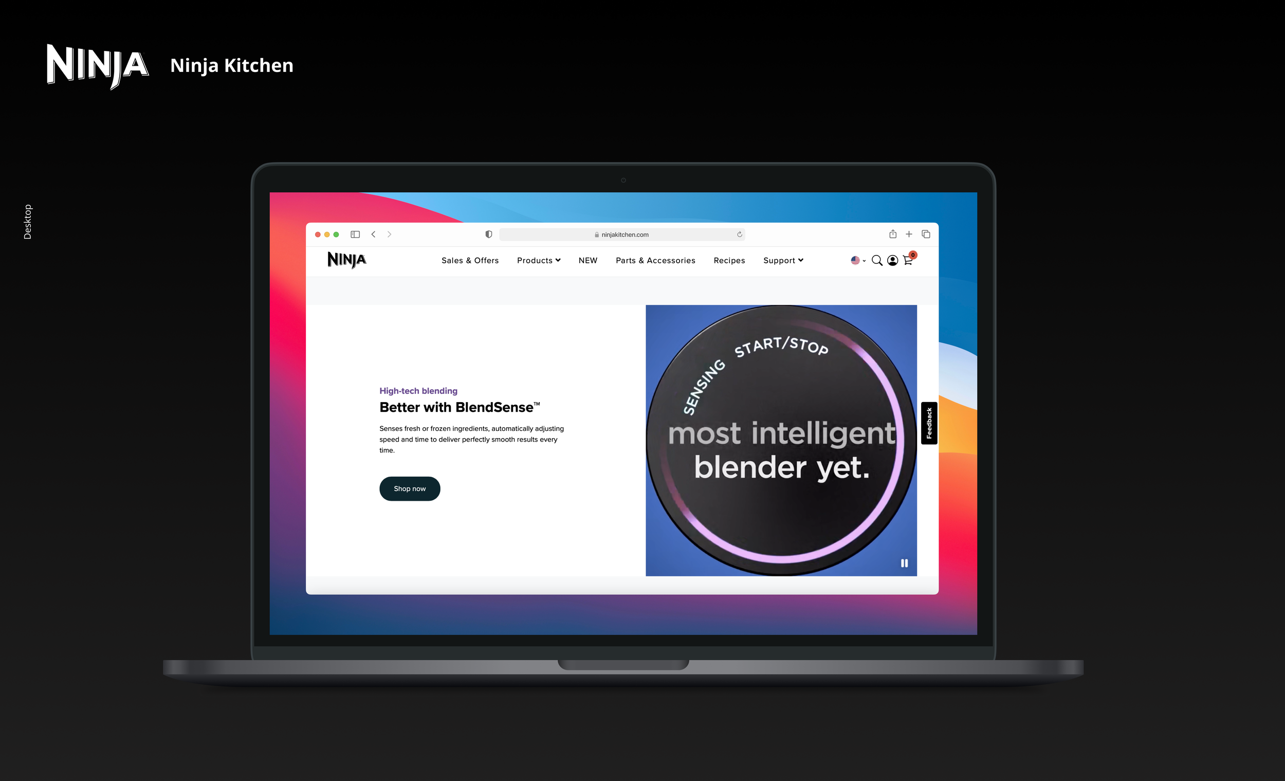
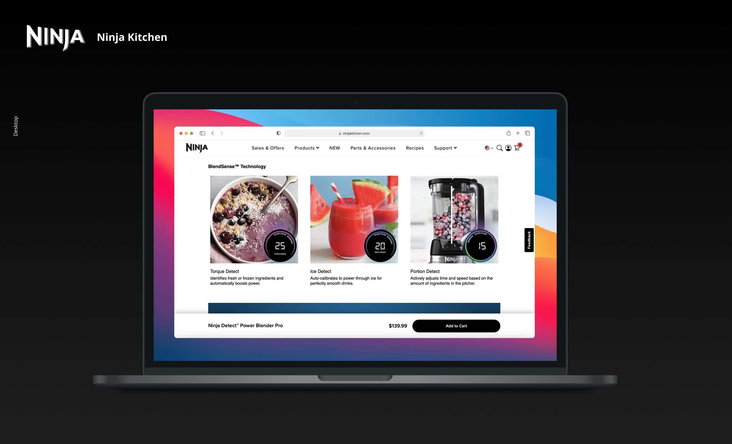
Product Detail Page (PDP) Optimization
Challenge: Key product information, such as warranty details and usage instructions, was buried or missing from the PDP.
Solution: Designed a PDP layout emphasizing critical details like features, warranty information, and product benefits. Included clear CTAs for adding products to the cart or exploring related accessories.
Cart and Checkout Flow
Challenge: The cart experience lacked visual hierarchy, making it difficult for users to review items or proceed to checkout.
Solution: Proposed a simplified cart design with clearer separation of products, pricing, and shipping information. Improved the visibility of the "Checkout" CTA and streamlined the guest checkout process.
Consistency Across Touchpoints
Challenge: Inconsistent design patterns and terminology led to a fragmented experience.
Solution: Recommended updates to align UI components and nomenclature across the site, ensuring a cohesive and professional look and feel.
*Click samples below to view full display.


Impact
Improved Usability: The refined IA and nomenclature enhanced product discoverability, reducing user frustration.
Increased Conversions: Optimized PDP and cart designs created a smoother path to purchase.
Consistency: Aligned design patterns and terminology across the website, fostering trust and ease of use.
Scalability: Delivered a robust framework for IA and design that could scale with future updates.